


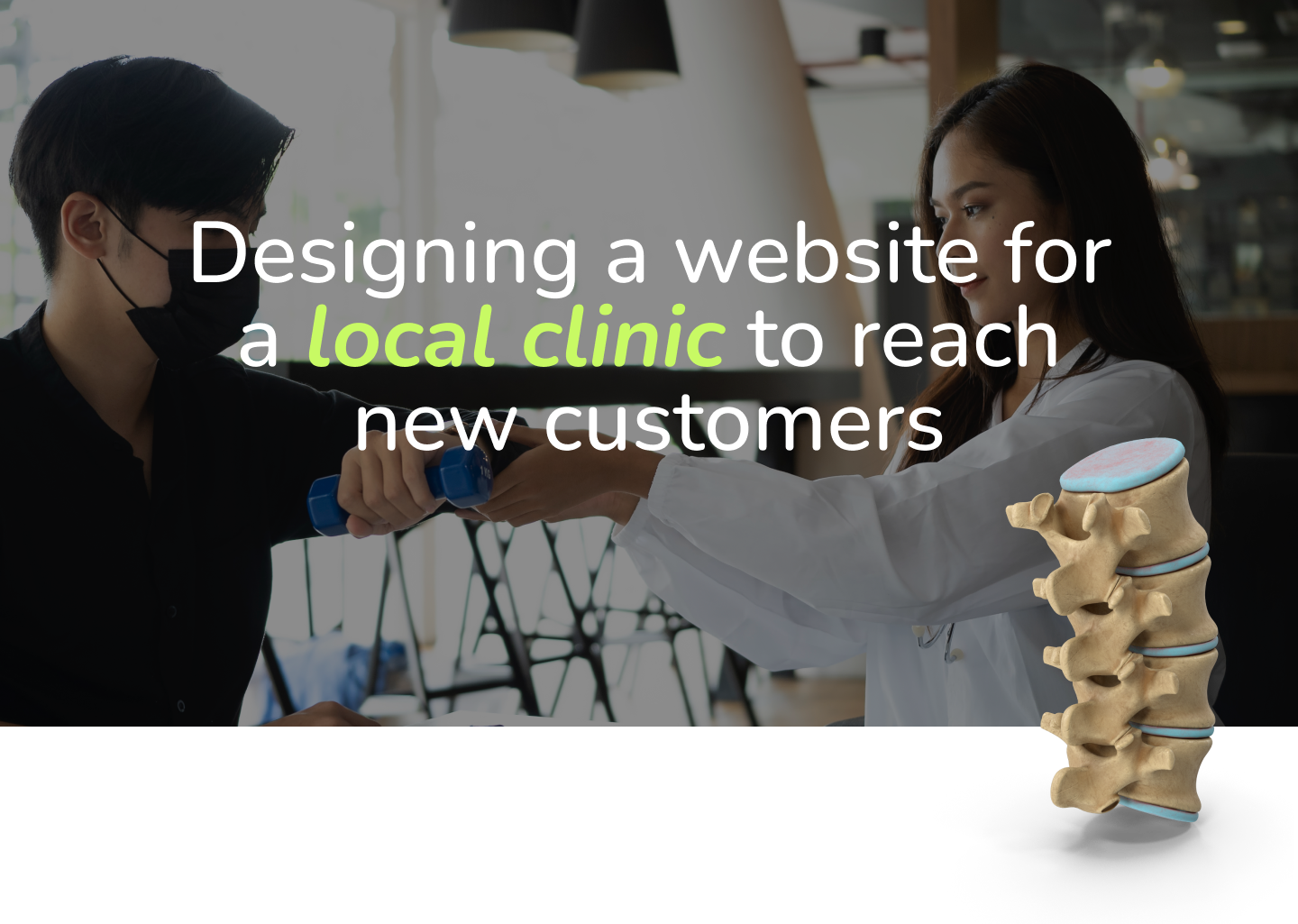
Ian the Chiro
A straight-forward website with a light personality
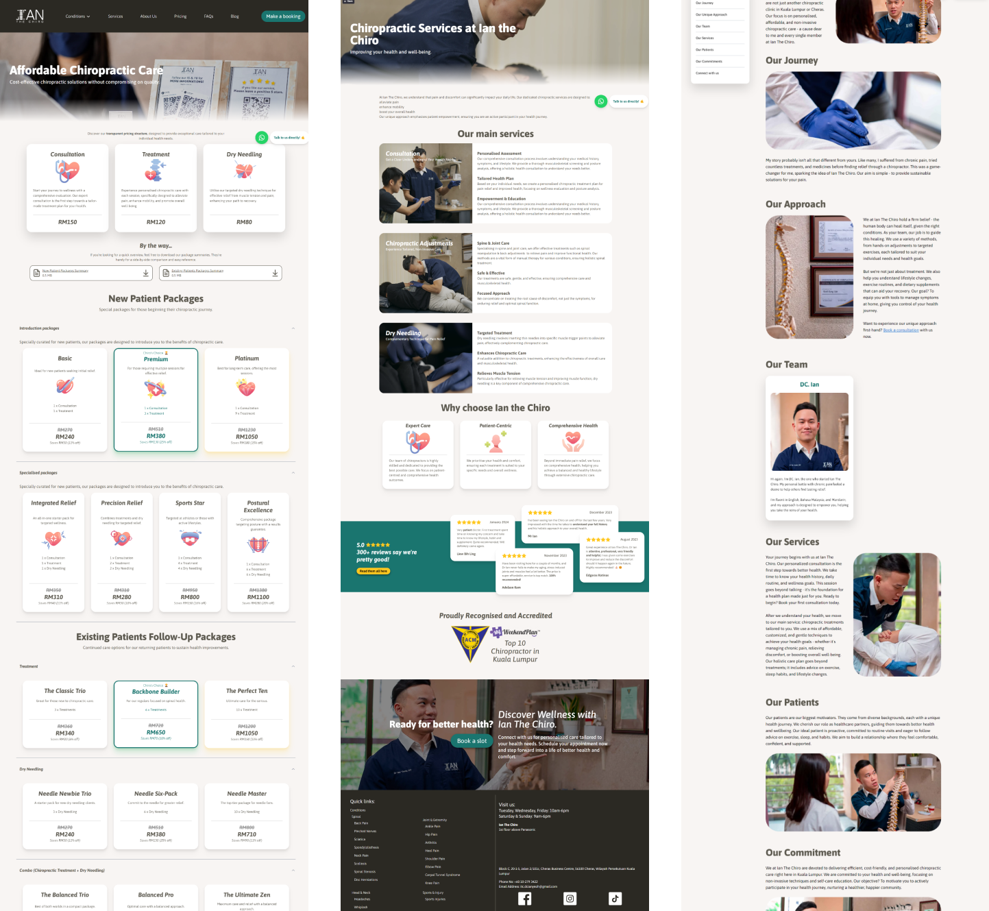
Designing a cross-platform website for Ian the Chiro to showcase their values and mission, with a blogging feature to engage with the community, in a friendly and intuitive manner.
UI/UX Design
User Research
Interaction Design
QUICK
[About]
SUMMARY
KEY RESPONSIBILITIES
- Collaborating closely with the Copywriter and Web Developer to deliver the website and adhere to the design process.
- Creating low-fidelity wireframes and high-fidelity prototypes.
- Conduct research and develop the UI identity.
LENGTH
1 month
MY ROLE
Product Designer
STAKEHOLDERS
Client
Copywriter
Web Developer
PRIMARY OUTPUT
UI Mockup & Wireframe
Brand Identity
THE PROBLEM
A Flexible Bespoke Website
The client wants a website with all the bells and whistles without the hefty monthly
subscription. He wanted the flexibility to adapt his website to keep up with the best SEO
standards and a blogging function.
GOALS, HMW

ONLINE PRESENCE
- How might we create an online presence and landing page for the business to reach new customers?
FUNCTIONALITY & COST
- How might we avoid using website providers that cost too much for the client?
- How might we provide all the functionalities and flexibility the client wants?
BRAND IDENTITY
- How might we craft clear direction for the brand identity that would resonate with potential customers?
RESEARCH METHODS

USER INTERVIEWS
- With stakeholder: to identify expectations and business requirements
- With target audience: to identify their frustrations and goals with chiropractic websites

COMPETITIVE ANALYSIS
- To identify the strengths and areas of improvement of competing businesses
RESEARCH INSIGHTS
No inherit opposition to chiropractic practices
We found that most consumers within the business' target audience have a few common factors
that they consider when visiting a chiropractic clinic. Everyone we asked had never visited
a chiropractic clinic before, but weren't opposed to the idea and in fact we're intrigued.
Motivation was important
When asked why they've never gone, they said it was due to lack of propulsion; they never
really needed to visit a chiropractor, they just let their body aches subside over time
or they just learn to live with it. We found this to be a particularly interesting insight.
Word of mouth is key
Additionally, we asked them what would make a chiropractic clinic appealing to visit. All of
them said that they'd visit if it felt friendly or familiar, and if it had good reviews on
Google or word of mouth recommendation. Other points that came up often were affordability,
clean premises, and trustworthy doctors.
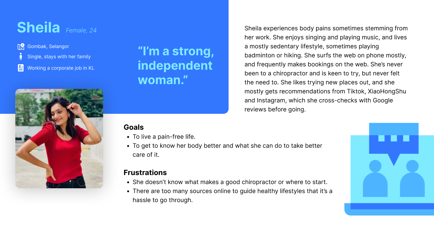
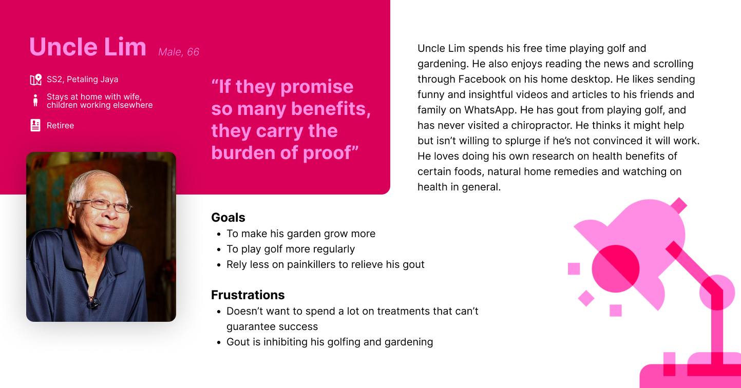
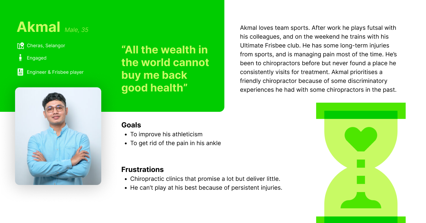
User Personas
To understand the creative direction we had to go in, I crafted user personas based on the
target demographics. This helped me immensely in designing while keeping the user in mind,
because it was no longer a list of factors to consider, but three unique characters to think
about.
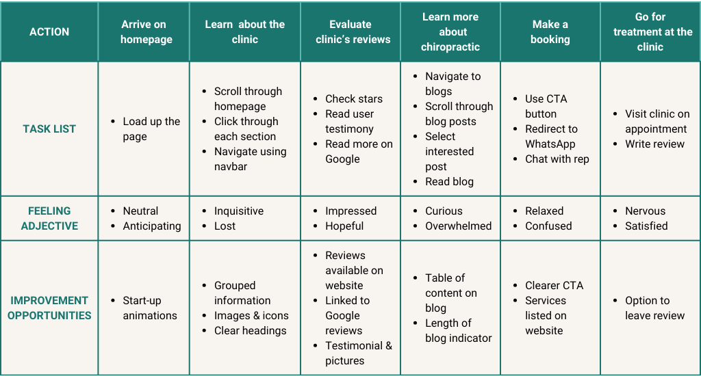
User Journey Map
Designer bias is an issue I try to avoid when designing UX, and I was especially conscious of
it in this project because the target audience is quite far from myself. To reduce the impact
of designer bias, I used user personas and also a user journey map to document the sequence of
events and interactions of the user.
The user journey map also helped me identify the edge case of when users don't go through with
their goal because of overwhelming cognitive overload.
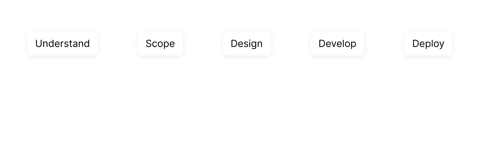
DESIGN
APPROACH
A Collaborative Approach
At every step of development, we went back to our client Ian to see how he feels about the
progress of the project. We involved him in our decisions, and he returned the favour with
trust in our judgement.
I worked closely with the web developer as well to make sure the designs were executable
within the timeframe as well as within his expertise. We discussed in great detail on
compromises in the design, as well as making sure the website was responsive across desktop,
tablet and mobile platforms. I developed the mobile interfaces as well, but the web developer
would consult me often on the action to take between breakpoints.
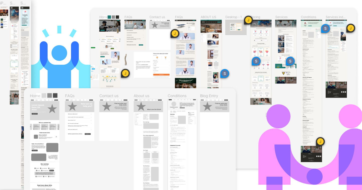
An Iterative Strategy
Since this was a two-person team and only one month to get a website up from scratch, as the
UI designer I came up with the wireframe as soon as possible so my friend could begin
development. To prevent doing double-work, we made sure to check in with the client if he was
happy with the direction it was going in before moving on to implementing. This meant going
back and forth during the prototype, ideate and test phase a few times before arriving at the
final product.
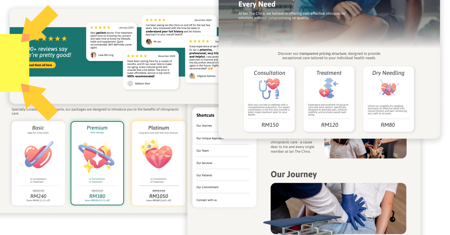
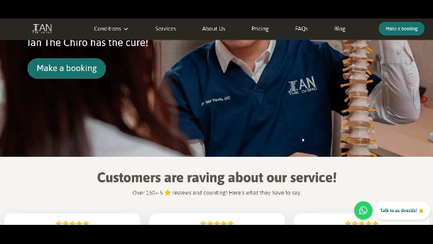
Constantly on the Page: Call to Action
The most important information would sit on the homepage, with minimal images to prevent slow
loading times. Throughout the implementation, we made sure the pages load up within 400ms in
compliance with the Doherty Threshold.
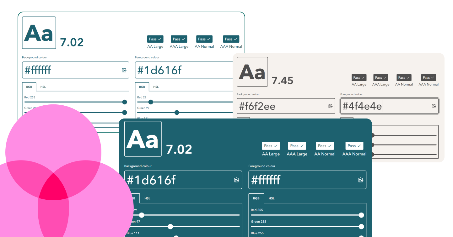
Equity-Focused Design
In designing and implementing, we made sure to comply with the Web Content Accessibility
Guidelines 2.0 (WCAG) so the website is inclusive of people with disabilities. Decisions of
the colour palette and font sizes were always checked with A11Y and WCAG checkers for AAA
Specialized Support compliance for readability for all visual impairments.
While coding the website as well, we made sure to comply with WCAG guidelines like including
alt text, using the button element in HTML for clickable buttons, and a linear content flow
that supports keyboard navigation.
Hand Drawn Illustrations
The client wanted the make sure the website didn't feel sterile like a typical clinic, so I
suggested to lighten up the seriousness with illustrations. I developed the illustrations
myself using Procreate with consistent stylings based on the usage.
THE
OUTPUT
This project is shipped! View for yourself
here
.
jocelynneohl@gmail.com
LOCATION
Kuala Lumpur, Malaysia