


Michael Page
Building & scaling Michael Page's first design system
20 different shades of blue may sound gorgeous, but is quite the nightmare in a website. I took it upon myself to build from scratch a design system that streamlines developer handoff, guarantees accessibility, and improves consistency and user experience.
Front-end development
Design token management
Documentation
QUICK
[About]
SUMMARY
KEY RESPONSIBILITIES
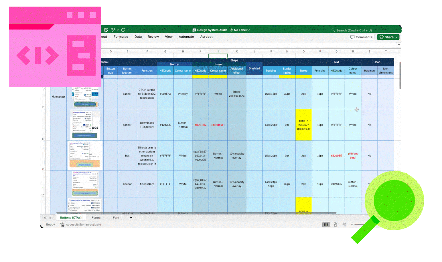
- Conduct a deep-dive audit of current website for existing states of every component.
- Obtain buy-in from Creative Services and Web Products Director to facilitate adoption.
- Developing and documenting design tokens and libraries with clear guidance for implementation.
LENGTH
4 months
MY ROLE
Design Systems Designer, Researcher, Project lead
STAKEHOLDERS
Product Owner
Director of Web Products
Global Creative Services Studio
Developer
PRIMARY OUTPUT
Design System on Figma + Dev Mode Compatibility
THE PROBLEM
Repetitive Amendment Cycles with Developers, and An Inconsistent Website Design
Just from a quick site audit, we could see that there are many inconsistencies found across
the website.
GOALS, HMW
PRIORITIZATION
- How might we determine what needs to be in the design system and the order of priority of what needs to be delivered first?
SCALABILITY
- how might we design from day one with scale, collaboration, onboarding and communication with stakeholders like designers, product owners and developers in mind?
RESEARCH INSIGHTS
Lack of hand-off procedure
The current process is sending over the Figma prototype to developers and they rebuild the
page with just and eyedropper and their eye.
Responsive and accessibility support
The website was designed with desktop view in mind, so mobile and tablet interfaces were
largely ignored, causing a poorer user experience.
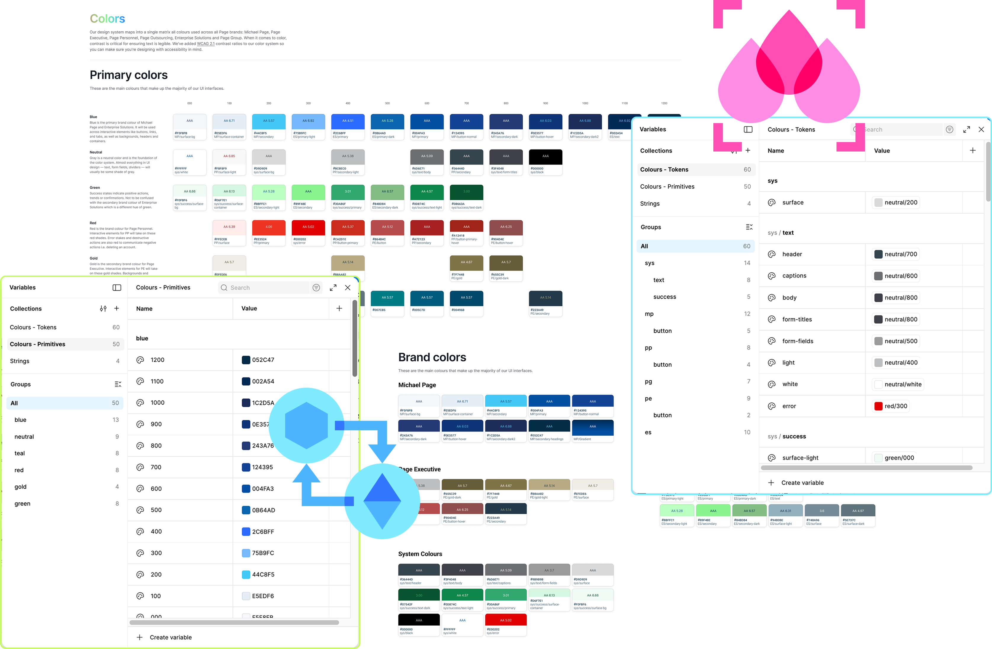
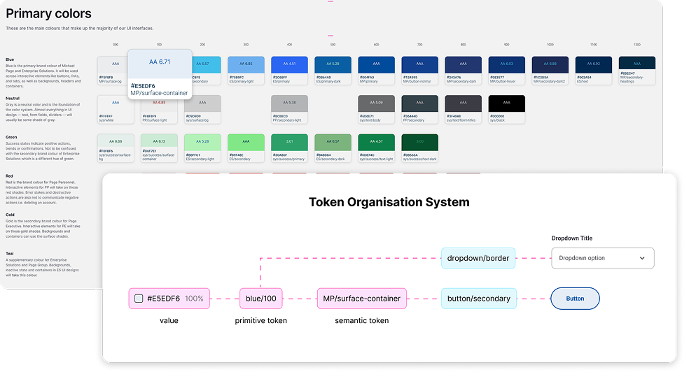
Colours, oh my!
The branding guidelines colour palette from 2014 is outdated, because over the years more
colours were approved for digital usage, but were not documented. there were 20+ HEX codes
of various blues, each with slightly different uses.
DEVELOPMENT
APPROACH
Cyclical Development
The process of development was cyclical and can be generally summarised as such:
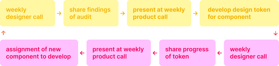
Phase 1: Deep Site Audit
I work closely with the designers that had done work on the website before to understand their
workflow and obtain crucial files with components they have developed before. I compare and
contraste every existing component for their font size, colour, button colour, hover state,
spacing, etc.
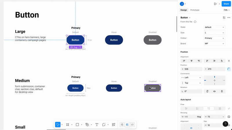
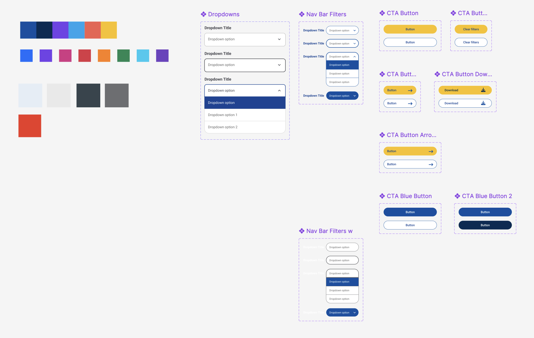
Phase 2: From Monoliths to Modules
I break down the components into properly named and tokenized colors, typography, and
grid/spacing values to Figma and codes are in sync.
Phase 3: Monolithic But Modular Library
Designers, developers and product owners need a clear, simple-looking library for future page
designs. So, the last step of the design system is building it back into ready-to-use
components or content block.
CHALLENGES
Building for two brands simultaneously
The design system project ran parallel with the brand revamp done by an external agency, so
it was important to ensure the system could be updated seamlessly when the new branding
comes in.
Lack of clarity on what is “correct”
The updates to the website are designed and developed upon request to the studio team, so it
has passed through various graphic designers over the years. This led to many versions of
buttons, spacings, text hierarchy, etc.
THE
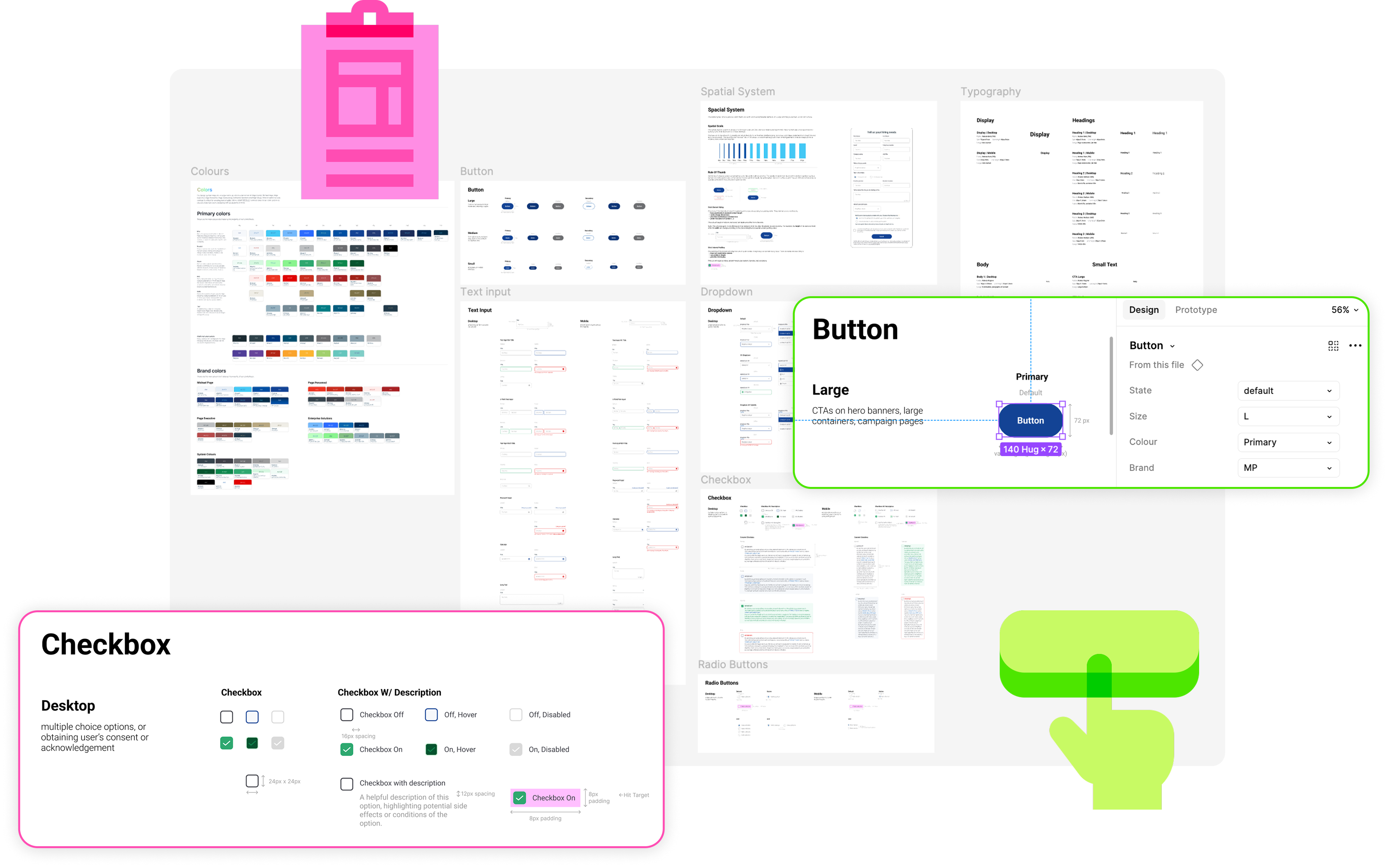
OUTPUT
A new single source of truth for designers, developers, product owners and marketing teams to
refer to.
BEFORE
No colour library for digital platforms, usage of colour has been inconsistent, with new
shades popping up, and product owners must test for accessibility regularly.
AFTER
A dedicated tokenised colour library with colour pairing that passed WCAG AAA standards for
contrast.
BEFORE
No spatial system, hence no consistency in padding, object scale, margins and spacing
between sections.
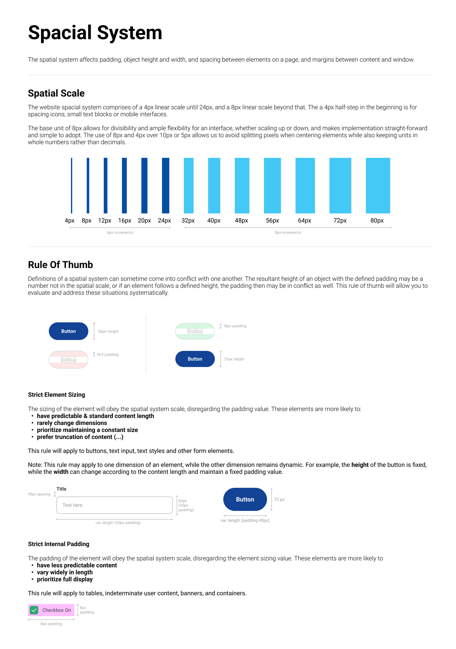
AFTER
A spatial system that's been tokenised in buttons and text hierarchy styles on Figma, as
well as on the developer's side.
BEFORE
Tokens are built for design use only & rebuilt as and when a new task comes in.
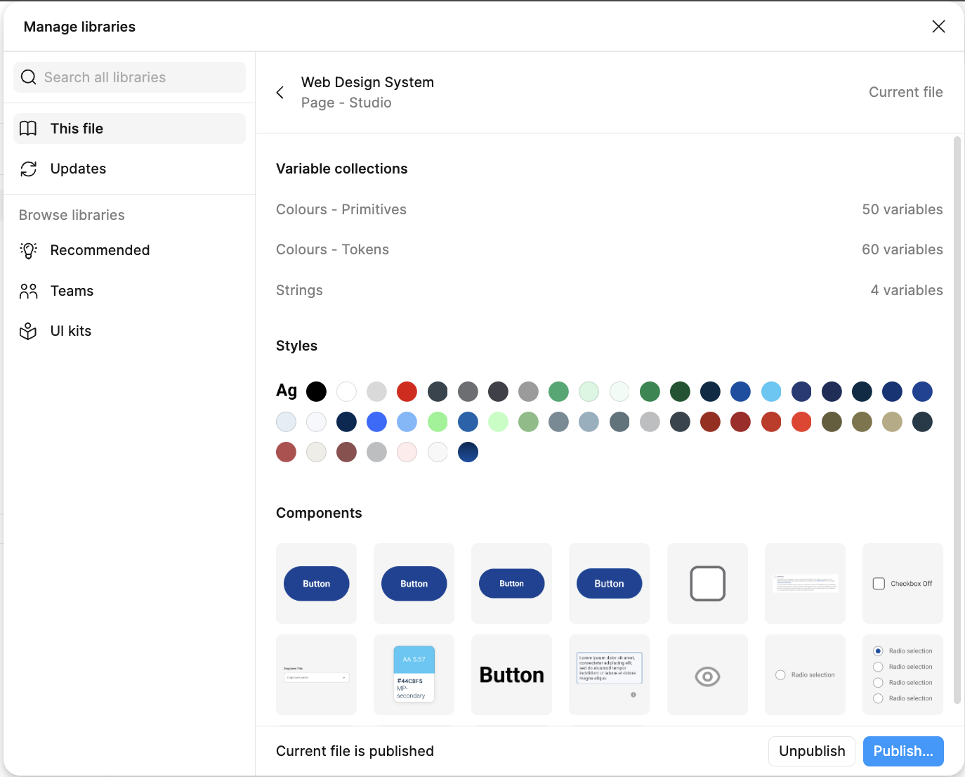
AFTER
The design system now can be imported as a library into every new project, ensuring
standardisation across elements components in design, code, CMS and Figma.
BEFORE
Developers refer to exported images from the Figma file and make guesstimates of font size,
use eyedropper for colours etc.
AFTER
Developers can use Dev Mode on the Figma file to refer to exact CSS and layout properties.
THE IMMEDIATE RESULTS
Since the project is ongoing, we're yet to see long-term results. However, instantly we
observed:
Smoother hand-offs and implementation
The product team have been very pleased with the smoothness of implementations by the
developer vendors, requiring much less amendments and were able to complete a new project in
a single sprint.
Faster design process
Time taken to develop designs has reduced significantly as common components like buttons
and form fields are plug-and-play, allowing designers more time to focus on designing the
custom, special features of a project.
NEXT STEPS
This is an ongoing project, and there are more improvements planned for the system.
Governance model & adoption tracking
Building the design system is the foundational step, but it's worth will only stand the test
of time if it's maintained well. A governance model will ensure new components are added
consistently and correctly without breaking the system. Adoption tracking will show us how
widely the system is being used across the business. Both are important to maintain
reliability and scalability over time.
Breakpoint tokens
Currently, the system's components are duplicated, one for mobile and one for desktop. In
the future, I would like to make it so that it's a single component, adaptable to the
project's device frame.
Adapting to the new branding
The company is rebranding in 2026, so the design system's content will require an overhaul.
The skeleton will thankfully remain the same, and will just be a matter of switching in new
fonts and colours, and further adjusting from there.
jocelynneohl@gmail.com
LOCATION
Kuala Lumpur, Malaysia